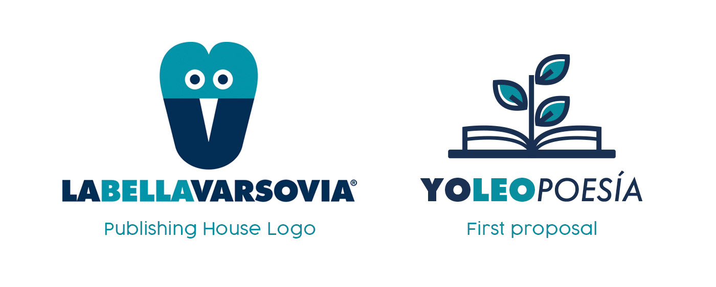
Logo design and teaching card layout for Yoleopoesía (Ireadpoetry).
Yoleopoesía is a new project of the publishing house La Bella Varsovia. A website with educational cards about the poetry books they publish, destined to high schools.
The design had to be aligned with the aesthetics, colors and typo of the "mother" brand. The first proposal was a book with a laurel, classic symbol of poetry.
After, the concept of logo evolved towards the idea of bee/swarm for two reasons: on the one hand, Plato definition of poets as bees and, on the other, the project had a strong sense of community.
So three new proposals...
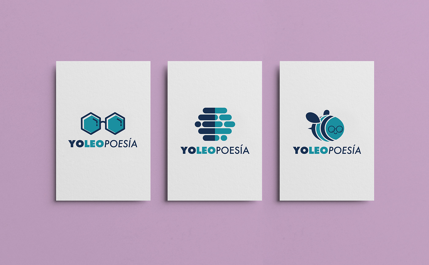
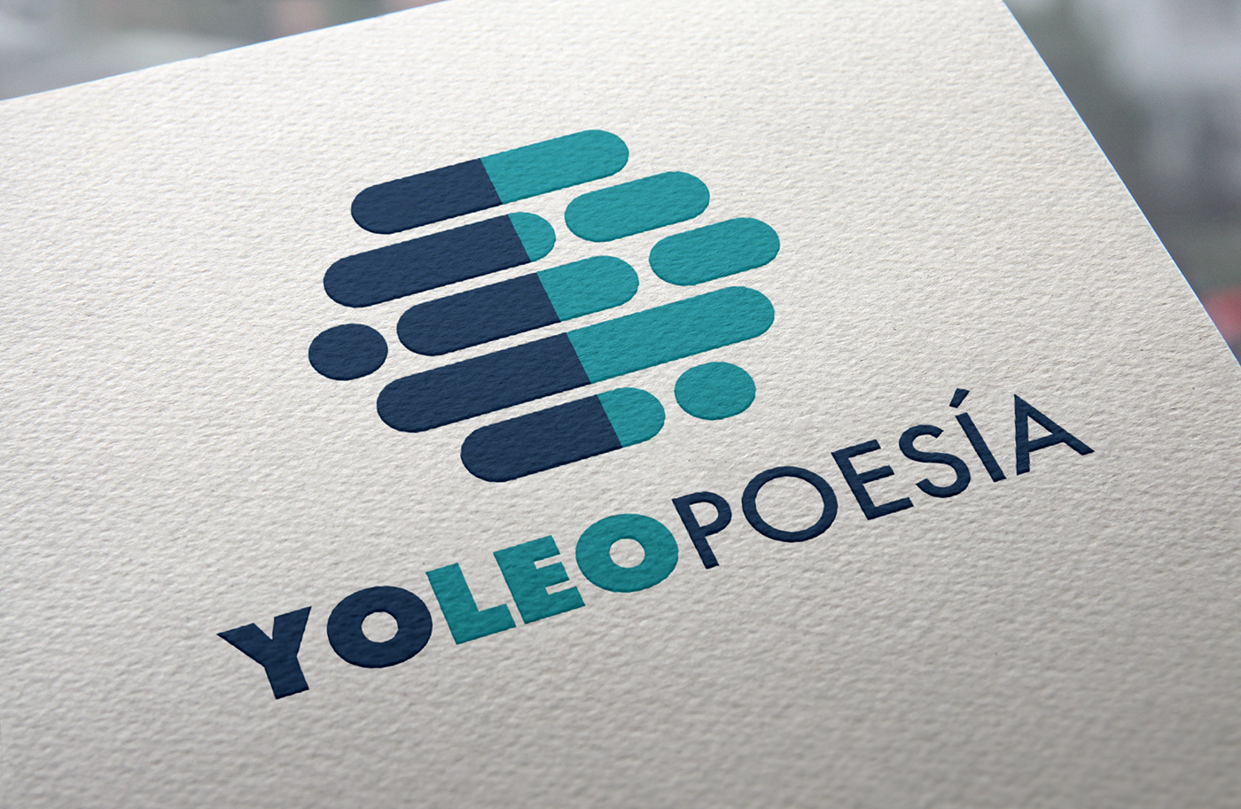
The second one was the chosen one. Its geometric shapes of the honeycomb contrasted with the asymmetry of the poetic verse were winners.
And here is the design of the educational or teaching cards for the books: